

There’s probably someone out there online who is interested in buying jewelry, and there’s a chance that they search for it on the internet, they find it, they check the price, and then they suddenly stop. They look through the photos of the jewelry again, search for more information, check the reviews, the shipping details, and sometimes open the return policy. The product may have caught their attention, but something else is keeping them from pressing the “buy” or "add to cart" button you put on your store website.
That something is called “hesitation”; it is a roadblock for selling jewelry online. When we take a look at jewelry online, we cannot pick it up with our own hands, examine its details, try it out, or judge whether it actually feels as valuable or as good as it looks on screen. Instead, we have to make that decision by making use of the information that the store is providing. Product photography, product descriptions, reviews, shipping information, return policies, and trust signals all help the buying decisions of the shopper.
The Customer Cannot Pick Up the Jewelry Before Buying
One of the simplest reasons why customers hesitate to purchase online happens to be one of the hardest problems for a jewelry brand to address: the customer cannot touch the product. They can’t hold a bracelet in their hands, feel its weight, or compare its size with their body before buying it. According to Shopify, jewelry buyers hesitate, because they can’t handle a piece of jewelry before buying, while BigCommerce indicates that online buyers see products primarily through written product descriptions, photos, and videos.
Real-world example: Modern Myth presents its Skinny Hammered Bangle through product photography that lets shoppers see the piece itself while also providing context for how it appears as jewelry.
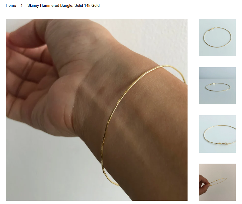
Presentation becomes important because of this. A photo of the product has to present information that would normally come from being able to physically examine the product. Close-up images can show smaller details, while different angles can help buyers see more than just a front-facing photo. Lifestyle photographs can add another layer of information by showing how the piece looks when it’s worn. The goal is not only about making the product look more attractive, but it is also to give the buyer enough visuals for them to form a clearer picture of what they are trying to buy.
Real-world example: Joule Project shows a gallery with their jewelry being worn by real people and tells you the stories behind the picture.

Product Information Has to Fill in What the Camera Cannot
Photography is one piece of the puzzle; it can show a piece of jewelry, but it can’t answer every question. Buyers also want to know what the jewelry is made of, how heavy or large it is, how it should be taken care of, and what they can expect from it. Shopify suggests that brands should describe their products as if the shopper can’t touch them, including details such as weight, materials, dimensions, and care instructions.
Real-world example: Modern Myth provides product information alongside its Skinny Hoop Earrings, giving shoppers details beyond what can be shown through
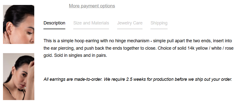
This matters a lot, because vague information leaves more room for interpretation, and misinterpretation is the last thing you need from a customer. Clear product descriptions help turn product details into something buyers can use when deciding whether the piece matches what they want. When a product page answers those questions, buyers have less information to fill in themselves.
Customers Also Need to Know What the Jewelry Will Look Like on Them
A product photo can show what the piece looks like, but shoppers may still wonder what it will look like when worn. A pair of earrings photographed on a plain background may look different from when it’s shown being worn on a person.
Real-world example: CLED shows its Core Loop Earrings both as standalone product photography and while being worn, giving shoppers additional context for how the earrings look when used.
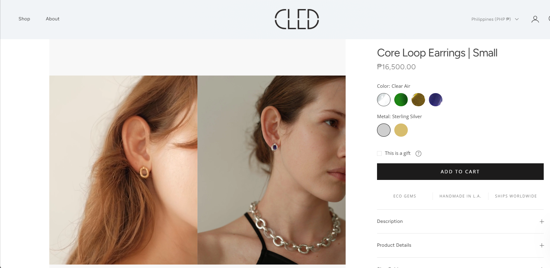
This is why context and scale matter. Showing jewelry being worn gives buyers another view for understanding its size. Lifestyle images can help them imagine wearing it themselves, while close-up and product-only photos can preserve the details. Together, these different views serve the buyer by helping them imagine it as something they will own and wear.
Trust Becomes Part of the Product
Customers aren’t only deciding whether they like the jewelry or not. They are also deciding if they trust the brand behind it. For a first-time buyer, those questions are more than the product itself: Is this store legit? Will the piece of jewelry actually look like in the photos? Will the quality match the description? Will the order arrive as promised? BigCommerce describes trust signals as factors that help reassure customers and reduce the perceived risk of buying. Trust is also an essential requirment when you want to be successful with Agentic Storefronts.
Customer reviews can also help answer a buyer’s questions because it gives them information that comes from other buyers who already bought the product before them. A customer reviews whether the color looks the same as it did in the photo, whether the piece feels well made, or whether it looks different once worn. Photos and videos submitted in the reviews can also give another view that a brand’s photography can’t always provide. Reviews give them a view of what other customers experienced.
The Product Page Has to Answer the Questions Behind “Should I Buy This?”
By the time a buyer reaches the checkout section, they are not simply asking whether they like the jewelry. They are also deciding if they understand it well, trust the seller, and feel comfortable with the risks involved. A product page has to do a lot more than just display a beautiful photo.
A strong jewelry product page brings all these pieces together. It shows the product from different angles, provides information about its characteristics, materials, size, appearance, and reviews. It should also provide information about shipping, returns, and other purchase policies and conditions easy to find. According to Shopify, the product page is the place where shoppers evaluate a product’s perceived value and make decisions. It’s ecommerce UX guidance recommends that a product page must answer the questions shoppers have before they even think of asking them.
The goal here is not to get rid of every reason a customer might hesitate. Some buyers simply need more time, or to compare, or decide if a piece of jewelry is not for them. But brands can control how much uncertainty their product page has. When buyers can clearly understand what the product is, see what it looks like, and learn from other buyers, they’ll be left with fewer unanswered questions standing between interest and purchase.
About the author
Kranz is a Content Writing Intern at Mata, where he focuses on research, writing, and developing content for the company’s blog posts.